
2018年8月18日雅思大作文预测:混合图题
题型5 话题分类:混合图 属性:二级重点
参考题目1
You should spend about 20 minutes on this task. The graph and table below give information about water use worldwide and water con...
You should spend about 20 minutes on this task. The graph and table below give information about water use worldwide and water consumption in two different countries. Summarise the information by selecting and reporting the main features, and make comparisons where relevant.
图片
解题思路
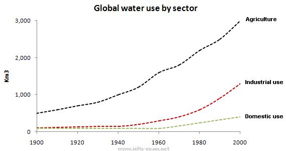
【首段】总述两图显示1900年到2000年间世界用水变化情况 【二段】分述工业农业以及家庭用水在这段时间的变化情况 【尾段】分述巴西和刚果人口土地以及人均用水量
范文
The graph shows how the amount of water used worldwide changed between 1900 and 2000. Throughout the century, the largest quantity of water was used for agricultural Purposes, and this increased dramatically from about 500 km3 to around 3,000 km3 in the year 2000. Water used in the industrial and domestic sectors also increased, but consumption was minimal until mid-century. From 1950 onwards, industrial use grew steadily to just over 1,000 km3, while domestic use rose more slowly to only 300 km3, both far below the levels of consumption by agriculture. The table illustrates the differences in agriculture consumption in some areas of the world by contrasting the amount of irrigated land in Brazil (26,500 km3) with that in the D.R.C. (100 km2). This means that a huge amount of water is used in agriculture in Brazil, and this is reflected in the figures for water consumption per person: 359 m3 compared with only 8 m3 in the Congo. With a population of 176 million, the figures for Brazil indicate how high agriculture water consumption can be in some countries.
参考题目2
The chart and graph below give information about sales and share prices for Coca-Cola. Write a report for a university lecturer de...
The chart and graph below give information about sales and share prices for Coca-Cola. Write a report for a university lecturer describing the information shown below. You should write at least 150 words. You should spend about 20 minutes on this task.
图片
解题思路
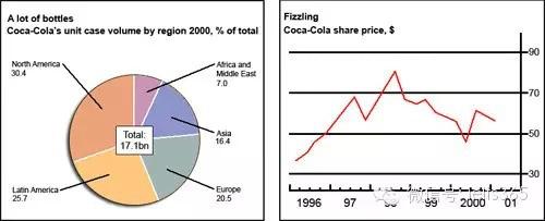
【首段】总述饼状图是关于可口可乐在2000年的销售分布,线状图是关于1996年到2001年股价变化情况 【二段】分述可口可乐2000年在各大洲的销售情况 【尾段】分述可口可乐公司从1996年到2001年的股价变化情况
范文
The pie chart shows the worldwide distribution of sales of Coca-Cola in the year 2000 and the graph shows the change in share prices between 1996 and 2001. In the year 2000, Coca-Cola sold a total of 17.1 billion cases of their fizzy drink product worldwide. The largest consumer was North America, where 30.4 per cent of the total volume was purchased. The second largest consumer was Latin America. Europe and Asia purchased 20.5 and 16.4 per cent of the total volume respectively, while Africa and the Middle East remained fairly small consumers at 7 per cent of the total volume of sales. Since 1996, share prices for Coca-Cola have fluctuated. In that year, shares were valued at approximately $35. Between 1996 and 1997, however, prices rose significantly to $70 per share. They dipped a little in mid-1997 and then peaked at $80 per share in mid-98. From then until 2000 their value fell consistently but there was a slight rise in mid-2000.
参考题目3
The following chart and table give information of UK cruise passengers in 1975 and 2003.
图片
解题思路
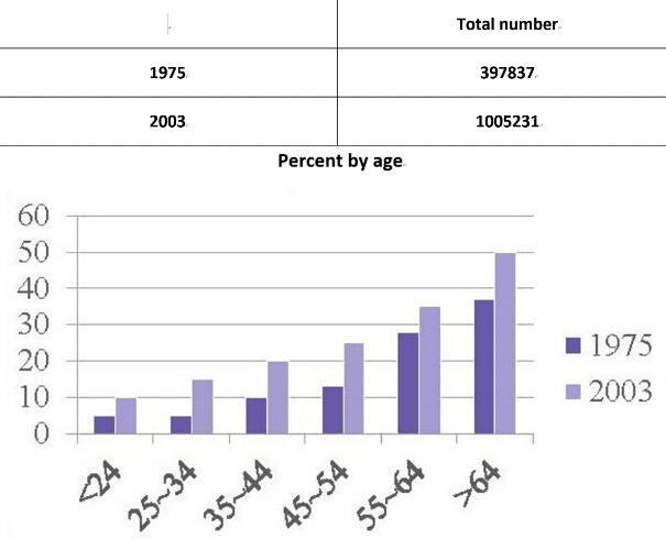
【首段】总述图表显示英国两个年份客船乘客总人数和比例的变化 【二段】分述1975年客船乘客的总人数以及不同年龄阶层的比例 【三段】分述2003年客船乘客的总人数以及不同年龄阶层的比例 【尾段】总述客船日益受到欢迎,年龄越大越喜欢乘坐客船
范文
These two charts reveal the total cruise passenger number and the percentage of two different years among different age groups in UK. The figures for the UK cruise passengers in 1975 showed an upward trend in all age groups. In the former three age groups, the percentages were all below 10%. And then it increased by 10-20% every decade, reaching 35% among those age are between 55 and 64. Obviously, cruise was the most popular among those aged over 65, seven times the number of the youngest age group. There were 1005231 passengers cruising in the year of 2003, much higher than that in 1995. Likewise, the proportion of 2003 also experienced a similar tendency. There were 10% of cruise passengers in the under 24 year-old group, to which the smallest percentage belonged. The following age groups saw a gradual rise every decade, from 15% in the 25-to-34-year-olds to 33% in the 55-to-64 year-old group. Among the passengers whose age was over 65, nearly 50% of them went on a cruise. To conclude, cruise becomes more popular among different age groups and the interest become keener as age grows.
参考题目4
The climograph below shows average monthly temperatures and rainfall in the city of Kolkata.
图片
解题思路
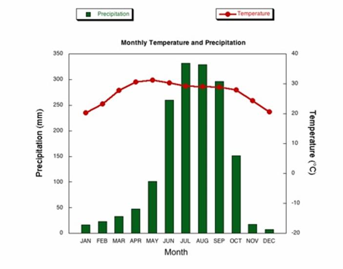
【首段】总述图表比较Kolkata一年里温度和降雨量的变化 【二段】总述雨量变化很大而温度很稳定以及雨量和温度的最值出现月份 【三段】分述一月到五月雨量和温度的变化情况 【尾段】分述六月到十二月雨量和温度的变化情况
范文
The chart compares average figures for temperature and precipitation over the course of a calendar year in Kolkata. It is noticeable that monthly figures for precipitation in Kolkata vary considerably, whereas monthly temperatures remain relatively stable. Rainfall is highest from July to August, while temperatures are highest in April and May. Between the months of January and May, average temperatures in Kolkata rise from their lowest point at around 20°C to a peak of just over 30°C. Average rainfall in the city also rises over the same period, from approximately 20mm of rain in January to 100mm in May. While temperatures stay roughly the same for the next four months, the amount of rainfall more than doubles between May and June. Figures for precipitation remain above 250mm from June to September, peaking at around 330mm in July. The final three months of the year see a dramatic fall in precipitation, to a low of about 10mm in December, and a steady drop in temperatures back to the January average.
参考题目5
The chart gives information about UK immigration, emigration and net migration between 1999 and 2008.
图片
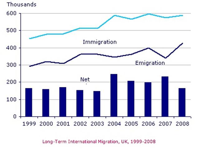
解题思路
【首段】总述1999到2008年英国入境移民出境移民和净移民人数 【二段】总述入境移民和出境移民人数都增长了,净移民在2004和2007年达到顶峰 【三段】分述1999-2004年三种移民人数的变化 【尾段】分述2005-2008年三种移民人数的变化
范文
The chart gives information about UK immigration, emigration and net migration between 1999 and 2008. Both immigration and emigration rates rose over the period shown, but the figures for immigration were significantly higher. Net migration peaked in 2004 and 2007. In 1999, over 450,000 people came to live in the UK, while the number of people who emigrated stood at just under 300,000. The figure for net migration was around 160,000, and it remained at a similar level until 2003. From 1999 to 2004, the immigration rate rose by nearly 150,000 people, but there was a much smaller rise in emigration. Net migration peaked at almost 250,000 people in 2004. After 2004, the rate of immigration remained high, but the number of people emigrating fluctuated. Emigration fell suddenly in 2007, before peaking at about 420,000 people in 2008. As a result, the net migration figure rose to around 240,000 in 2007, but fell back to around 160,000 in 2008.
- 03-27·2019年4月6日雅思写作小范围机经预测
- 03-25·2019年4月27日雅思写作机经预测
- 03-20·2019年4月25日雅思写作机经题目预测及范文
- 03-19·2019年4月13日雅思写作机经预测
- 03-18·2019年4月6日雅思写作小范围预测
- 12019-02-262019年3月9日雅思写作小范围预测
- 22019-02-122019年2月16日雅思写作机经预测
- 32019-01-262019年1月26日雅思写作小范围预测
- 42019-01-172019年1月19日雅思写作大范围预测
- 52019-01-172019年1月19日雅思写作小范围预测
编辑推荐
book.examw.com
-
 雅思9分之“听”为上策--新航道英语学习丛书¥39.00


- 模拟试题
- 历年真题