
2018年3月24日雅思写作考试A类机经重点预测
题型2 话题分类:线状图 属性:一级重点
参考题目1
The graph below shows the differences in wheat exports over three different areas. Write a report for a university lecturer descri...
The graph below shows the differences in wheat exports over three different areas. Write a report for a university lecturer describing the information shown below.
图片
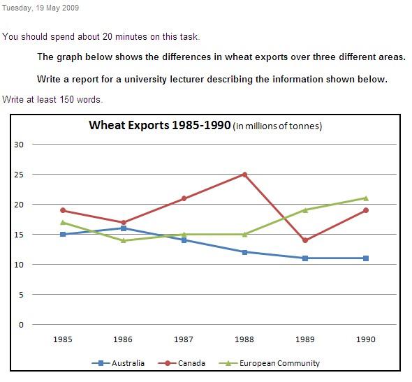
解题思路
【首段】总述澳大利亚加拿大和欧盟小麦出口在1985年到1990年之间的变化 【二段】分述澳大利亚这段时间小麦出口的变化 【尾段】分述加拿大和欧盟这段时间小麦出口的变化
范文
The three graphs of wheat exports each show a quite different pattern between 1985 and 1990. Exports from Australia declined over the five-year period, while the Canadian market fluctuated considerably, and the European Community showed an increase. In 1985, Australia exported about 15 millions of tonnes of wheat and the 登录查看全部内容
参考题目2
Eating sweet foods produces acid in the mouth, which can cause tooth decay. (High acid levels are measured by low pH values) Descr...
Eating sweet foods produces acid in the mouth, which can cause tooth decay. (High acid levels are measured by low pH values) Describe the information below and discuss the implications for dental health. You should write at least 150 words. Allow yourself 20 minutes for this task.
图片
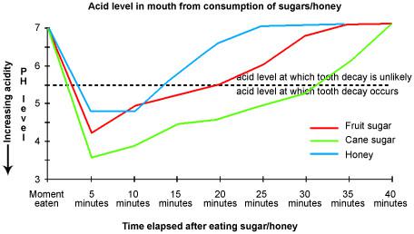
解题思路
【首段】总述过多的糖会伤害牙齿,因为糖会使得pH值下降 【二段】甜食让pH值下降到5.5以下,时间越长越容易蛀牙 【三段】分述蔗糖最易引起蛀牙 【四段】分述果糖和蜂蜜对pH值的影响 【尾段】总述果糖和蜂蜜要比蔗糖好
范文
Anyone who has visited a dentist has been told that eating excessive amounts of sweets risks harming the teeth. This is because sweets lower pH levels in the mouth to dangerous levels. When the pH level in the mouth is kept above 5.5, acidity is such that teeth are unlikely to be in danger of decay. Sweet foods, however, cause pH in the mouth to drop for a time, and the longer pH levels remain below 5.5, the greater the opportunity for decay to occur. 登录查看全部内容
参考题目3
The graph shows the spending on research into renewable energy of four countries from 1975 to 2000.
图片
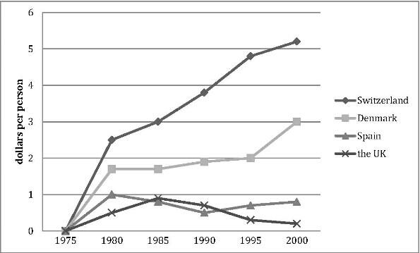
解题思路
【首段】总述1975年到2000年四个国家在调研再生能源上的支出变化 【二段】分述在1975年和1980年四国各国支出 【三段】分述瑞士丹麦1985到2000年支出变化 【四段】分述西班牙英国1985到2000年支出变化 【尾段】总述投资最多的国家是瑞士,投资最少的国家是英国
范文
The line graph compares how much these four countries spent on the research of renewable energy during the period from 1975 to 2000. In 1975, there were no countries budgeting for this research, while the spending from Switzerland, Denmark, Spain and the UK reached 2.6, 1.8, 1 and 0.5 dollars per person respectively in the year 1980. In the 登录查看全部内容
参考题目4
The line graph shows three different crimes in England and Wales in 1970-2005.
图片
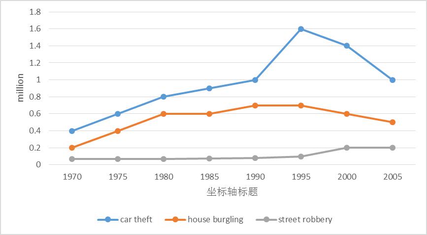
解题思路
【首段】总述图表显示1970年到2005年英格兰和威尔士三种类型的犯罪数量 【二段】分述汽车偷盗在此期间的变化 【三段】分述入室盗窃和街头抢劫在此期间的变化 【尾段】总述在英格兰和威尔士汽车盗窃和入室盗窃是最多的犯罪种类,街头抢劫则是最少的犯罪种类
范文
The line graph compares the number of three different kinds of crimes in England and Wales during the period from 1970 to 2005. In 1970,the number of car theft was the highest (0.4 million), which was twice the figure for house burgling and nearly eight times the figure for street robbery. Then it increased quickly and reached 登录查看全部内容
参考题目5
The line graphs show the percentage of people using public transport and people using private cars in five cities of Australia fro...
The line graphs show the percentage of people using public transport and people using private cars in five cities of Australia from 2000 to 2010.
图片

解题思路
【首段】总述图表显示2000年到2010年澳大利亚五个城市使用公交和私人轿车的比例变化 【二段】分述公交在五个城市使用比例的变化 【三段】分述私人轿车在五个城市使用比例的变化 【尾段】总述在澳大利亚私人轿车比公交更受欢迎
范文
The line graphs illustrate the changes of the percentage of the citizens using public transportation and using private cars in five different cities in Australia from 2000 to 2010. The percentage of those who use public transportation fluctuated in all cities during these ten years, among which the proportion of Sydney occupies the leading place. The second 登录查看全部内容
参考题目6
The line graph shows the percentage of different age groups of cinema visitors in a particular country.
图片
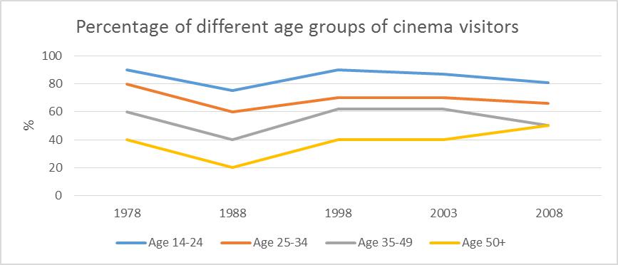
解题思路
【首段】总述图表显示某个国家的四个年龄阶层从1978到2008年到影院看电影的比例变化 【二段】分述14-24,25-34以及35-49这三个年龄阶层到影院看电影的比例变化 【尾段】分述50岁以上老年人到影院看电影的比例变化
范文
The line graph reveals the proportion of people who go to the movies by four age groups in a particular nation from 1978 to 2008. During the thirty years, three age groups (14-24, 25-34 and 35-49) experienced a similar pattern. The young (age 14-24) enjoyed visiting cinema the most, reaching 90% in 1978, and then it declined slightly to 75% in 1988 and grew up again 登录查看全部内容
参考题目7
The line graph shows the population in one European country.
图片

解题思路
【首段】总述图表显示某个欧洲国家从1950到2050出生率和死亡率的变化情况 【二段】分述这段时期这个国家的出生率的变化情况 【尾段】分述这段时期这个国家的死亡率变的化情况
范文
The line graph reveals both the birth rate and death rate in a European country during the year of 1950 to 2050. In 1950, the total number of people in this country was approximately 780,000, and after that it soared to nearly 1,000,000. However, after the peak in 1970, th 登录查看全部内容
参考题目8
The line below shows the land used for organic crops in two countries between 1985 to 2010.
图片
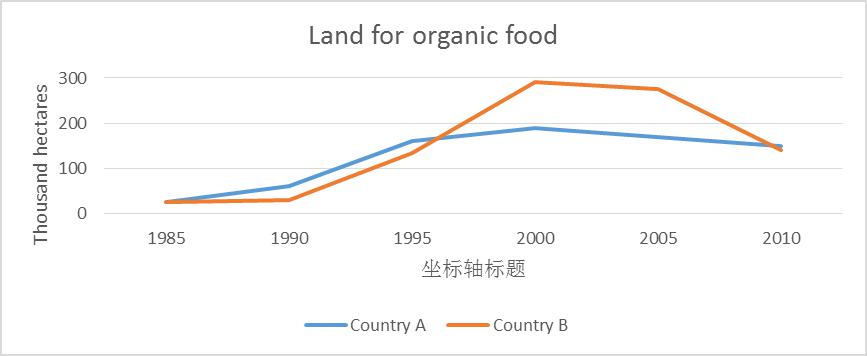
解题思路
【首段】总述图表显示A国和B国从1985到2010年有机食物土地面积的变化 【二段】分述从1985到2000年两国有机食物土地面积的变化 【尾段】分述从2000到2010年两国有机食物土地面积的变化
范文
The line gives us information about the area of land used for organic crops in country A and country B during the period of 1985 to 2010. In 1985, the area of land for organic crops of the two country were the same (25 thousand hectares). In the next five years, the figures in both countries experienced a slight rise, 登录查看全部内容
参考题目9
The line graph compares average yearly spending by Americans on mobile and landline phone services from 2001 to 2010.
图片
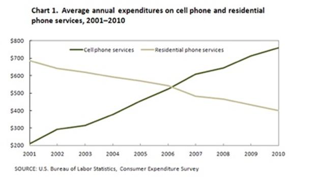
解题思路
【首段】总述图表比较2001年到2010年美国手机费用和固定电话费用的变化 【二段】总述使用手机费用增长固定电话费用减少,在2006年手机费用超过固定电话费用 【三段】分述2001年到2006年手机费用和固定电话费用的变化情况 【尾段】分述2006年到2010年手机费用和固定电话费用的变化情况
范文
The line graph compares average yearly spending by Americans on mobile and landline phone services from 2001 to 2010. It is clear that spending on landline phones fell steadily over the 10-year period, while mobile phone expenditure rose quickly. The year 2006 marks the point at which expenditure on mobile service 登录查看全部内容
参考题目10
The graph below shows the proportion of the population aged 65 and over between 1940 and 2040 in three different countries.
图片
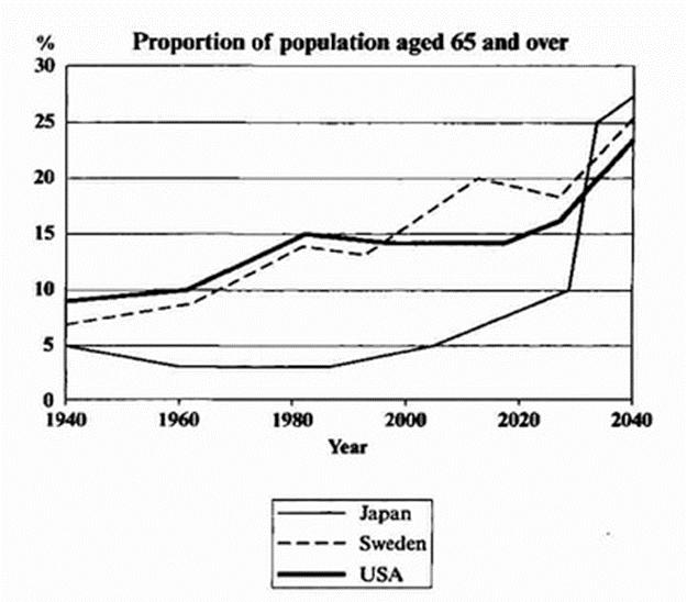
解题思路
【首段】总述图表比较了三个国家一百年里65岁以上老年人比例的变化情况 【二段】总述三个国家65岁以上老年人都增加了,日本预计涨幅最大 【三段】分述1940到2000年三个国家老年人的比例变化 【尾段】分述2000到2040年三个国家老年人的比例变化
范文
The line graph compares the percentage of people aged 65 or more in three countries over a period of 100 years. It is clear that the proportion of elderly people increases in each country between 1940 and 2040. Japan is expected to see the most dramatic changes in its elderly population. In 1940, around 9% of Americans 登录查看全部内容
参考题目11
The line graph compares the percentage of people in three countries who used the Internet between 1999 and 2009.
图片
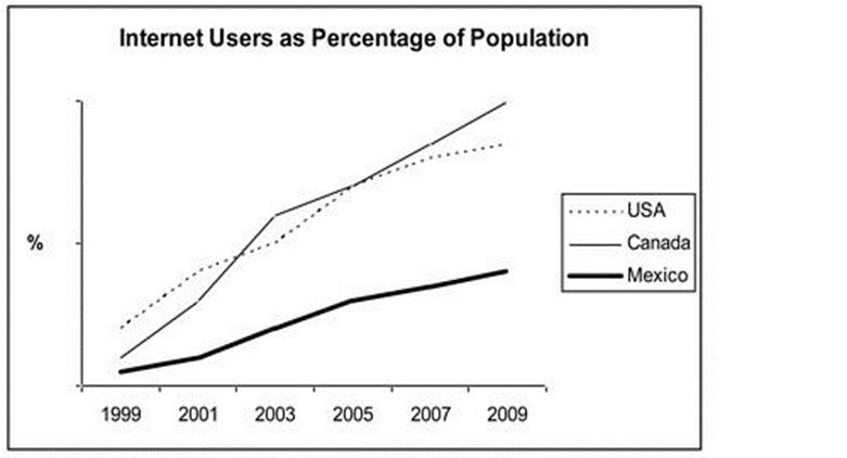
解题思路
【首段】总述1999-2009年三个国家网络使用率 【二段】总述加拿大美国的网络使用率大于墨西哥,加拿大增长最快 【三段】分述1999年和2005年三个国家的网络使用率 【尾段】分述2009年三个国家的网络使用率
范文
The line graph compares the percentage of people in three countries who used the Internet between 1999 and 2009. It is clear that the proportion of the population who used the Internet increased in each country over the period shown. Overall, a much larger percentage of Canadians and Americ 登录查看全部内容
- 03-27·2019年4月6日雅思写作小范围机经预测
- 03-25·2019年4月27日雅思写作机经预测
- 03-20·2019年4月25日雅思写作机经题目预测及范文
- 03-19·2019年4月13日雅思写作机经预测
- 03-18·2019年4月6日雅思写作小范围预测
- 12019-02-262019年3月9日雅思写作小范围预测
- 22019-02-122019年2月16日雅思写作机经预测
- 32019-01-262019年1月26日雅思写作小范围预测
- 42019-01-172019年1月19日雅思写作大范围预测
- 52019-01-172019年1月19日雅思写作小范围预测
编辑推荐
book.examw.com
-
 雅思9分之“听”为上策--新航道英语学习丛书¥39.00


- 模拟试题
- 历年真题